Flagship Washington Post App
Leading design for the discovery and story experiences on the Native App. This work aims to increase user engagement on the app and enable our users to build habitual behaviors.
Currently, I’m working on establishing a UI library / design system that can be used across our team for other designers to work on projects for the app.
To view some current work, feel free to check out these presentations: For You Feed and Audio in App.
Initially, the Native Apps team included three senior product designers and two product managers.
For my first year at The Post, our team spent our time working towards app unification. We moved from three apps at the beginning of this process to picking the best elements between our Select and Classic Apps to bring to our Flagship app. Moving into 2022, we’ve worked to improve the way we surface content for our users by bringing best-in-class journalism to our audience through our flagship app. We launched a new visual system for our app homepage, introduced new features like our vertical video experience and brought audio to the forefront of the app.
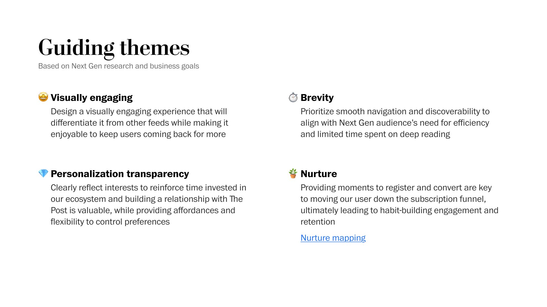
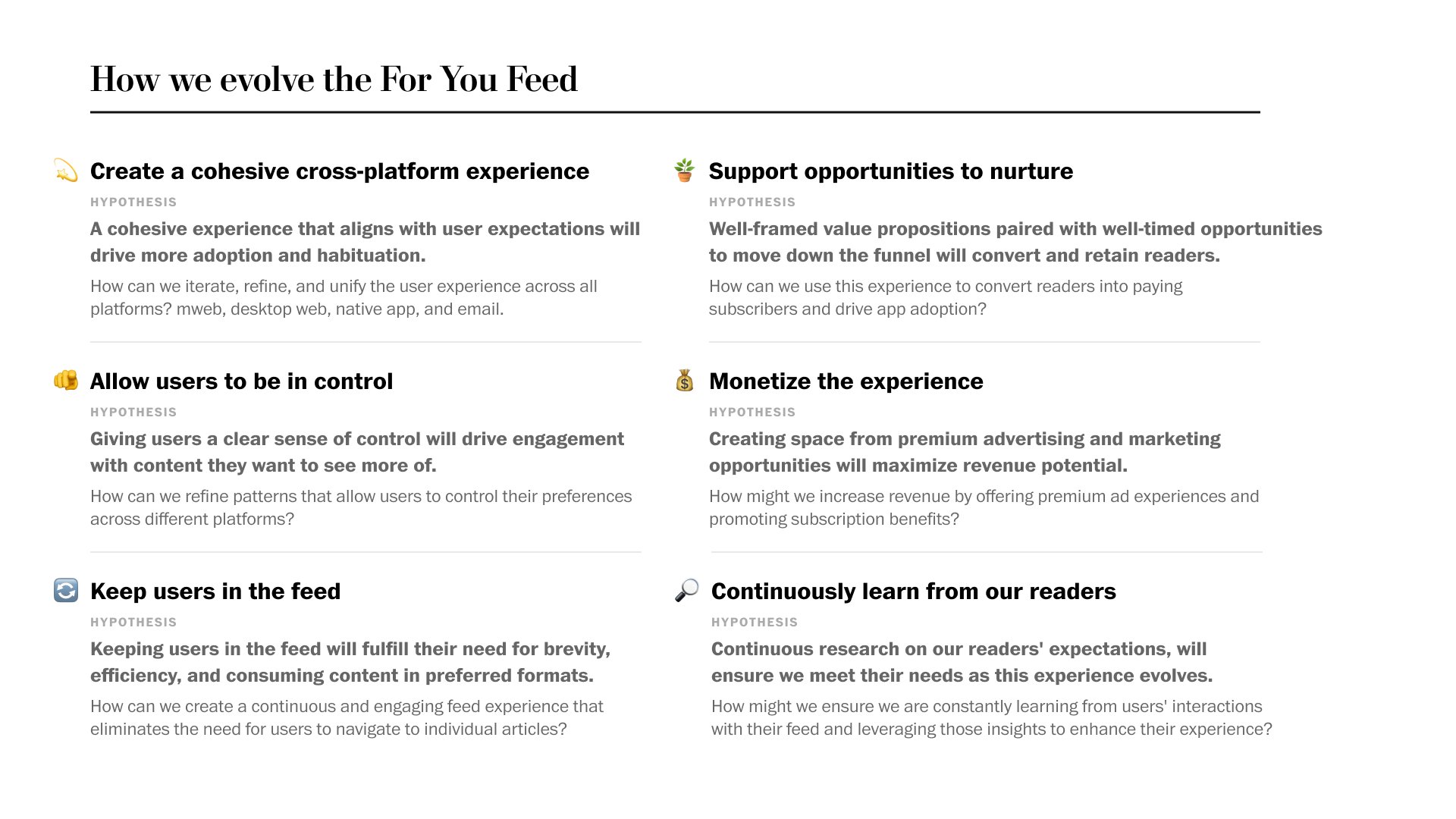
In 2023, I’ve led the work on our visual For You feed for the app, creating another visual pattern to expand our card system and testing the visuals to see what will delight the users. Additionally, I’m leading a second round of research and proposing design strategies for how we might redesign our app and its navigation. I’m collaborating with our media designer to set patterns for different types of content that will surface in the For You feed. Also, we’re thinking about how to meet more of the users’ needs for accessing our audio content and that flow.
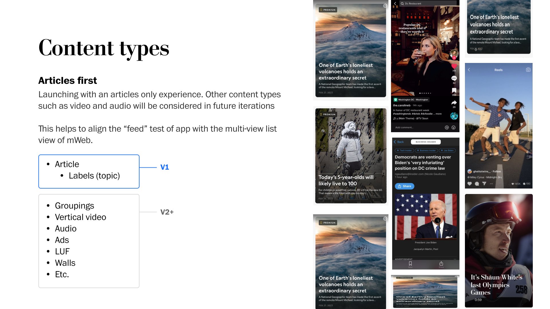
VISUAL FOR YOU FEED
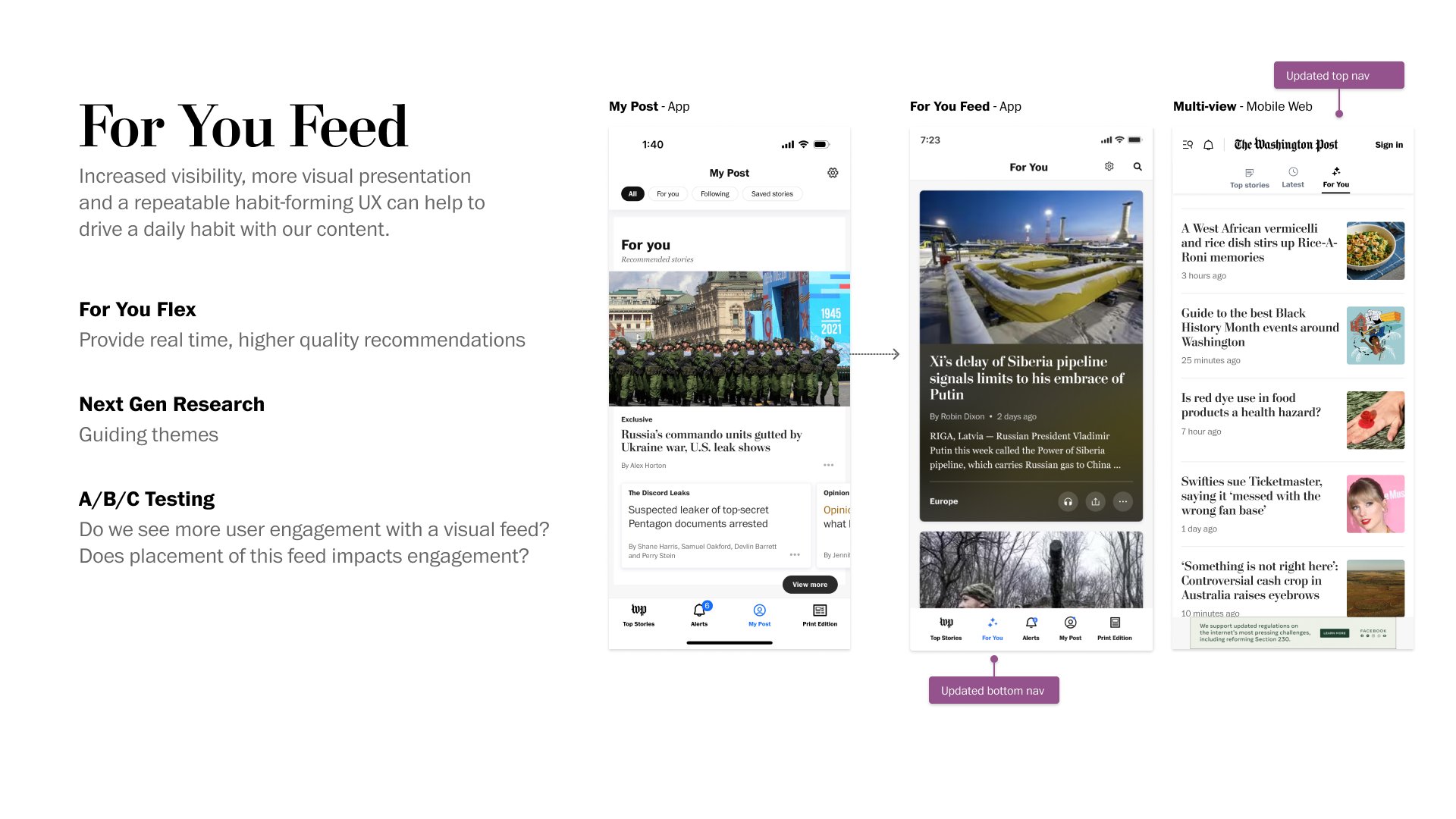
We hypothesized that increased visibility, more visual presentation and a repeatable habit-forming UX can help to drive a daily habit with our content.
Information Architecture + Navigation of the app (Summer 2023)
The app and the Post at large have changed a great deal since we first set out our familiar tab structure, and section navigation. Our journalism has expanded, we’ve pushed into new verticals such as Style, Food and Games. We’re making personalized content more of the core of the experience. We’ve combined apps with Rainbow, so it’s only logical that we need to revisit our core information architecture to make sure it reflects how users can best understand our content and experiences in 2023.

Objective: Reset the app navigation, with a clear hierarchy of what’s important, so users know what’s available and where to find what they are looking for.
Help users find what they’re looking for in the fewest number of steps possible
Help users understand the full breadth of the Post. Not just politics, or breaking news, but recipes, games, etc.
Ensure that users can customize/personalize their experience, when it’s valuable or makes sense to do so.
View presentation


CARDIFY: VISUAL PRESENTATION ON THE APP
Objective: Help users understand how Top Stories is organized by visually distinguishing groups of content. Provide a cleaner user experience that feels less chaotic.
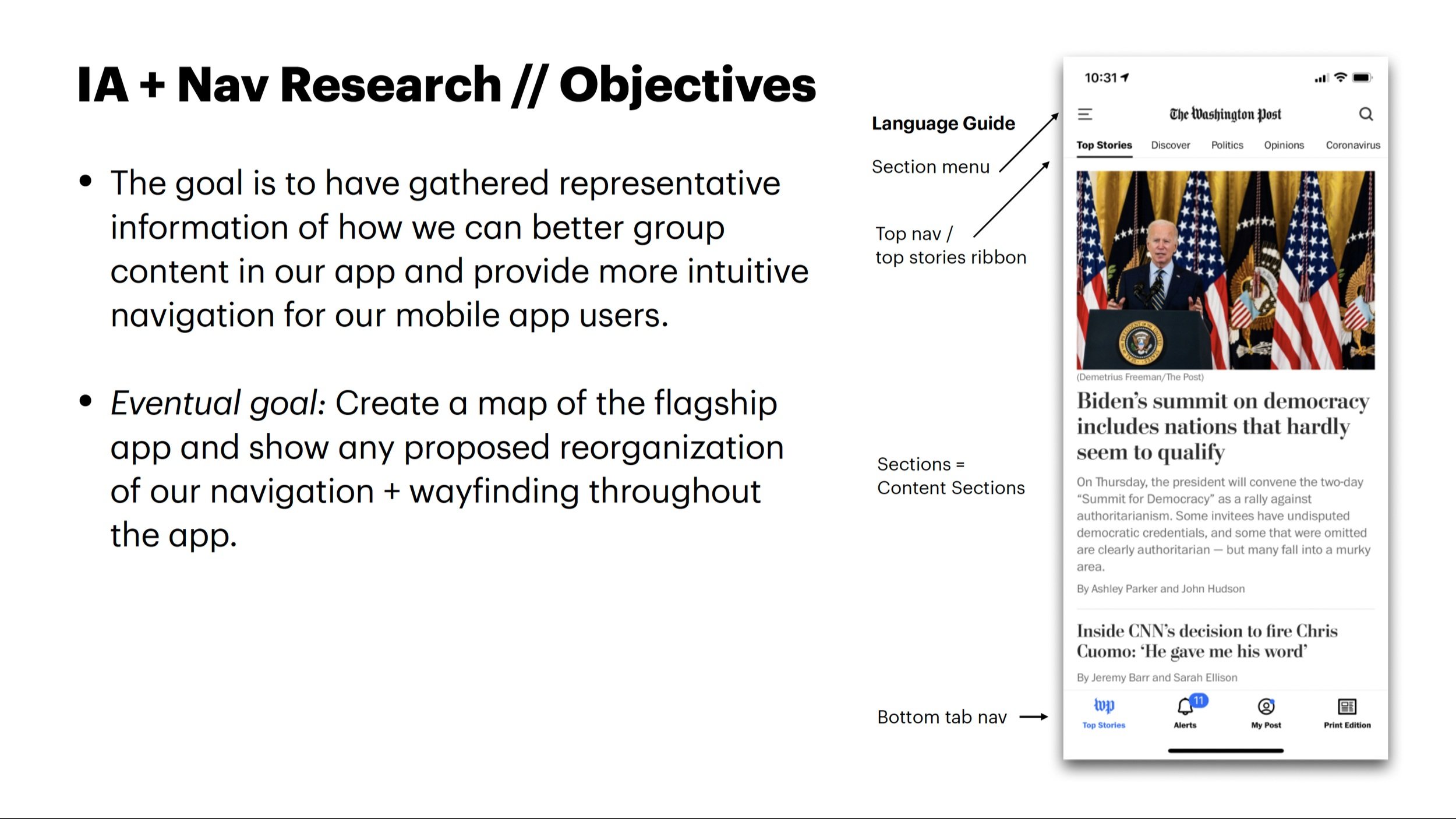
As a result of a research study (see below), our goal was to have representative information of how we can better group content in our app and provide more intuitive navigation for our mobile app users.
Building on the IA + Navigation research and our app unification, it presented an opportunity to reimagine the organization and hierarchy of Top Stories In general, most apps have a consistent homepage layout
Our users find our homepage experience to be “visually jumbled,” “articles are in a confusing arrangement,” and “hard to read.”
Some of this feedback comes from app review and some from user testing that I completed for several features
There has been an increase in the app reviews due to the unification of the two apps and two user bases (Rainbow and Classic).
Explorations & Approach
We want a more consistent experience for readers This project presents both a strategic and technical approach Have to worry about our internal tool and how our editors use it:
Avoid additional workflows to complicate our internal content management tool
App will group content in cards when there is a chain label or table label (packaging)
Articles that don’t fall under package label will be in standalone cards


DOCUMENTATION
At the end of the project, this system became a pattern library in Figma. There is documentation for the team and for the editorial stakeholders about the patterns can be used. These cards are a short cut for being able to design in the app and allow our team to quickly create content. The cards represent a system of packaging, padding and imagery rules to help create hierarchy and visual appeal will make things more consistency across our homepage.

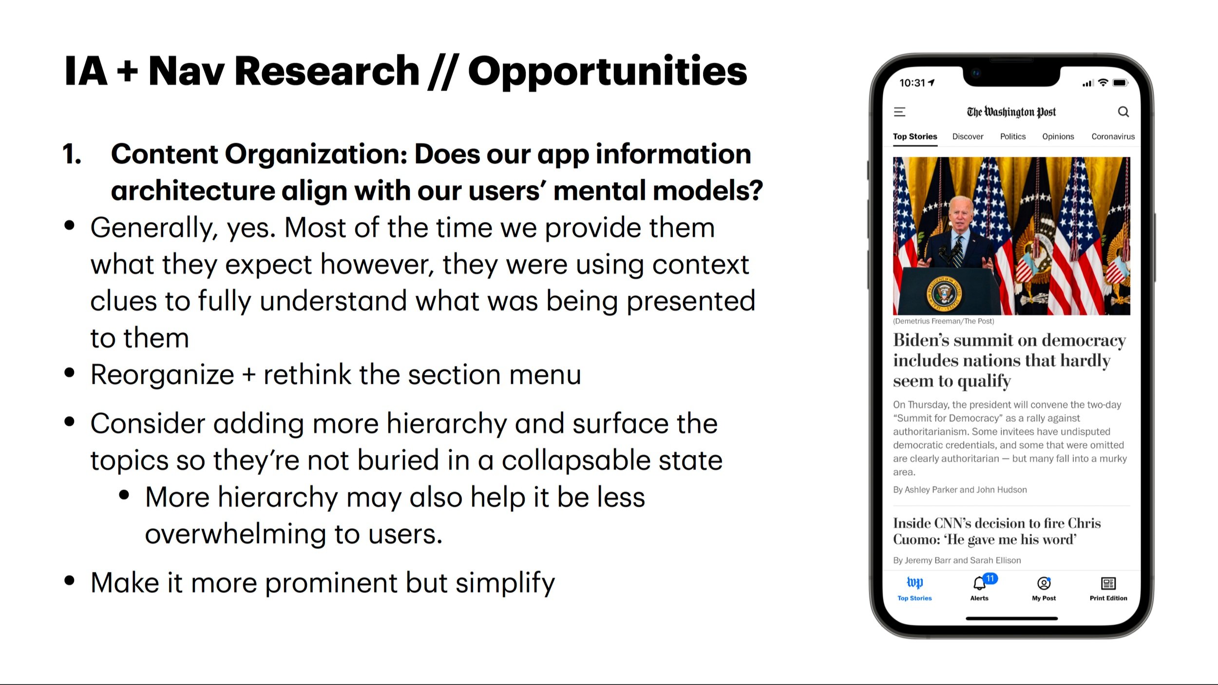
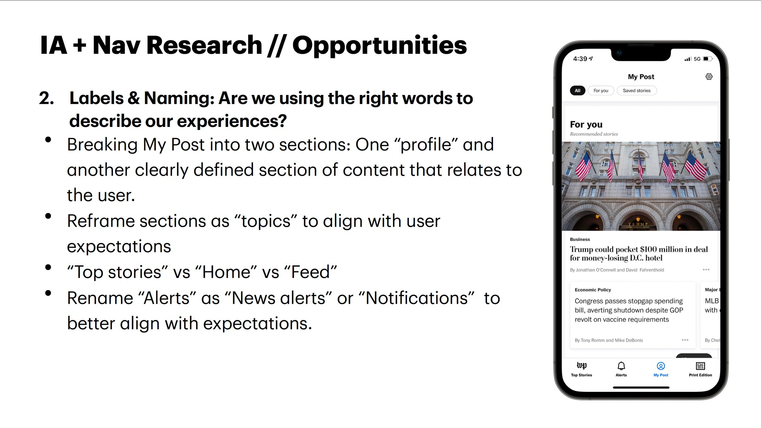
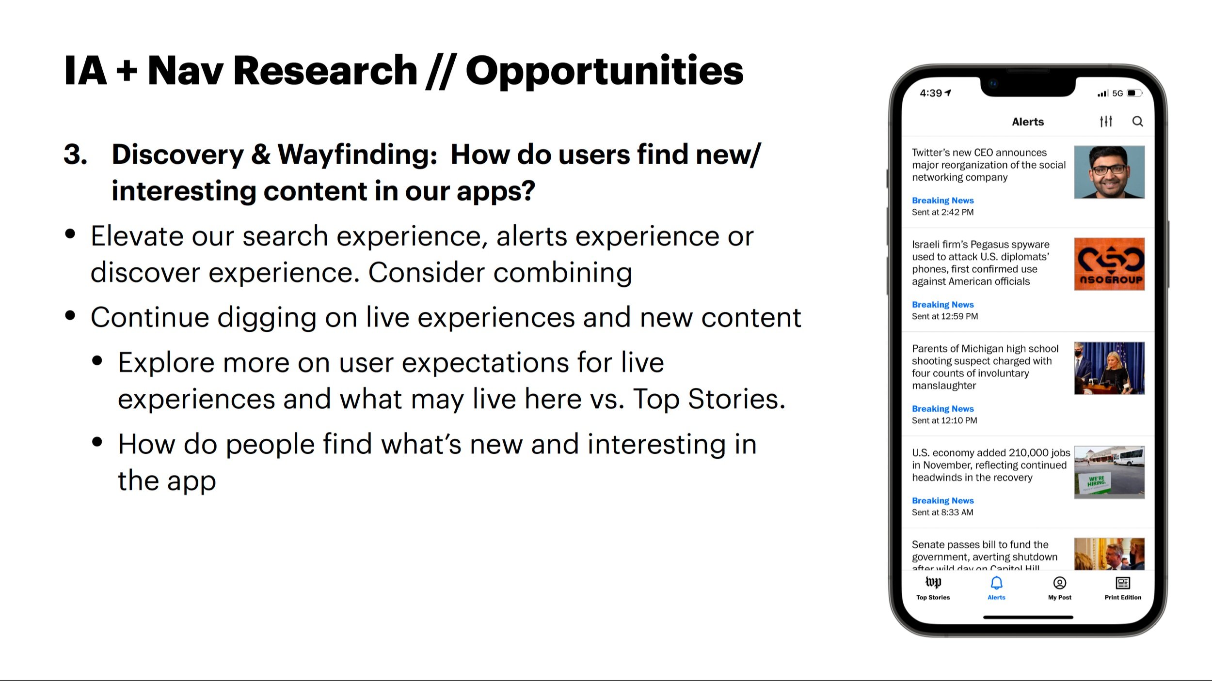
IA / Navigation Research (Part 1 - Dec 2021/Jan 2022)
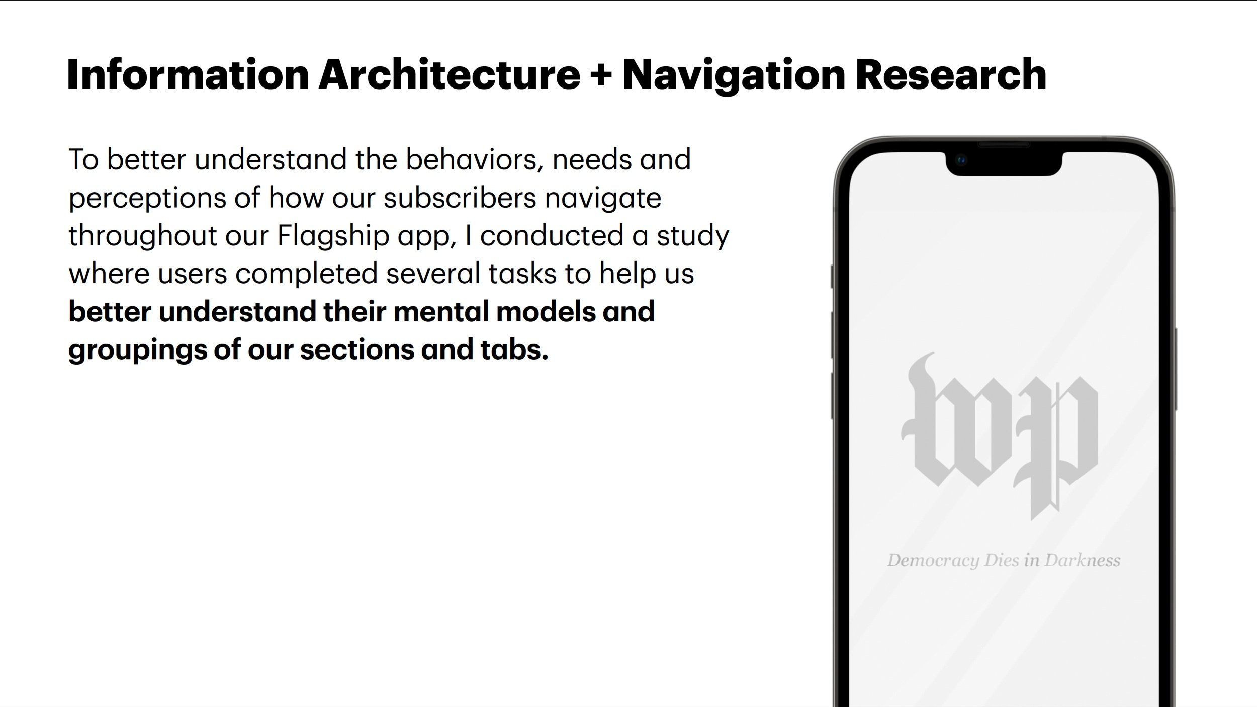
Objective: To better understand the behaviors, needs and perceptions of how our subscribers navigate throughout our Flagship app, we conducted a study where users completed several tasks to help us better understand their mental models and groupings of our sections and tabs.
In collaboration with our lead product manager, I led a research study where participants were asked about how they navigate on our app.
As a result of this study, our goal was to have representative information of how we can better group content in our app and provide more intuitive navigation for our mobile app users.
View Presentation about this work

Research methods:
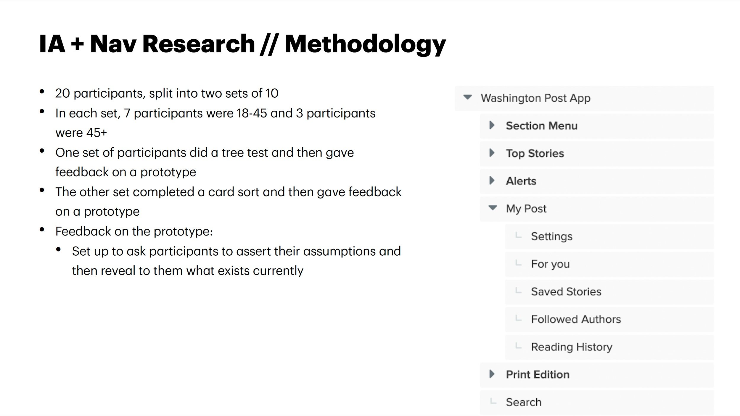
20 participants, split into two sets of 10
In each set, 7 participants were 18-45 and 3 participants were 45+
One set of participants did a tree test and then gave feedback on a prototype
The other set of participants completed a card sort and then gave feedback on the prototype
Feedback on the prototype - The prototype was set up to ask participants to assert their assumptions then reveal to them what exists currently