The exchange: A Data Platform at Capital One
From August 2019 to March 2021, I worked on The Exchange, an internal data platform at Capital One. This platforms enables data registration to facilitate internal associates’ ability to search and manage their data.
Lead UX/UI designer on the Publish portfolio, worked with a product partner + tech team
Partnered with a research manager, content strategist, design manager
Collaborated across silos to connect workflows with other UX designers
HOMEPAGE REDESIGN
Objective: To make The Exchange more intuitive, streamlined and succinct through a refined IA, nomenclature and UI for the homepage
What we heard from users:
“I come to The Exchange to do the same three things, why do I have to click in four layers every time.”
“I had no idea I could star APIs! That’s convenient, but where do they go when I do it?”
“I see the homepage as, you don’t have to advertise anything to me. I want
it to be all useful stuff.”

Before - Current state homepage (as of March 2021)

After - Proposal for future state homepage for a power user (scoped for late 2021)
Strategic design principles
To organize our content according to our users’ mental models in order to help them navigate The Exchange in a more intuitive, seamless way.
To anticipate and bubble up their most important workflows and common actions.
To expedite; to streamline; to speak to them in their own language.
To improve discoverability and way finding by exploring navigation conventions used by other applications and tools.
To design a scalable UX starting with the navigation and the homepage as The Exchange continues to develop into a robust platform.
RESEARCH METHODS
For this study, I was the lead designer working with a content strategist and research manager.
We interviewed 15 participants that participated in a card sorting, tree test and co-creation session. Additionally, we asked them for their expectations and reactions to low fidelity iterations we created of potential redesigns.
At the end of the study, I created two use cases of what the homepage could look like. One is a slimmed down version of the homepage for a user that visits the platform occasionally. The other is a “power user,” someone that their day-to-day job utilizes The Exchange.

How did we learn from language?
How did we learn from language?
What did users say about themselves and their roles?
What words did NOT folks use?
What words made sense or resonated?
What helped folks find their way
Sorting through alternate/unintended meanings
Language insights
Language that’s direct and action-centric = more intuitive (Create and Manage)
Lose the possessive tone of “your” or “favorite”
Leverage content conventions that our users are already familiar with (help, star, follow)

Examples of our co-creation screens. Our participants were able to create their own boxes and notes about what they expected to see
This is the slimmed down version of the homepage. Tara would be our less active user or someone who uses The Exchange more passively.
PUBLISHING ON THE EXCHANGE
During my year and half on the Data Experience Design team, most of my time was spent owning and designing the publishing workflow.
The Exchange breaks down its platform and portfolio into four superverbs: publish, manage, find and consume. These represent actions that our users need to do to successfully accomplish their day-to-day duties.
Publish encompasses the ability to register a dataset and make it accessible to other Capital One associates. Once done successfully, the datasets can be easily found and consumed by associates. The dataset owner can then manage their data and monitor its usage.

An example of a user flow that explains how a user would edit their data. When editing data, you can make “breaking changes” which initiates another path for the user to create a new dataset on The Exchange.
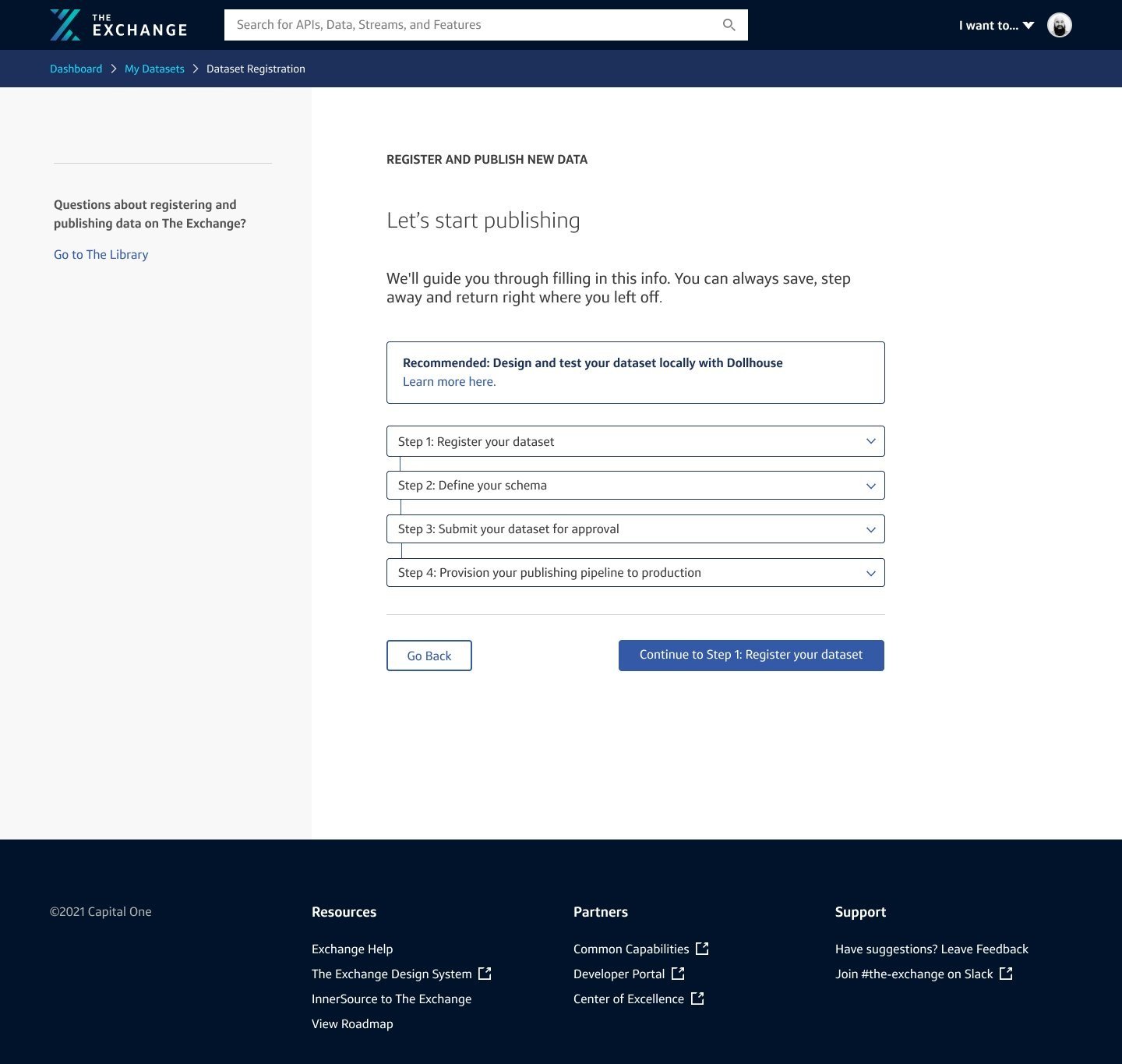
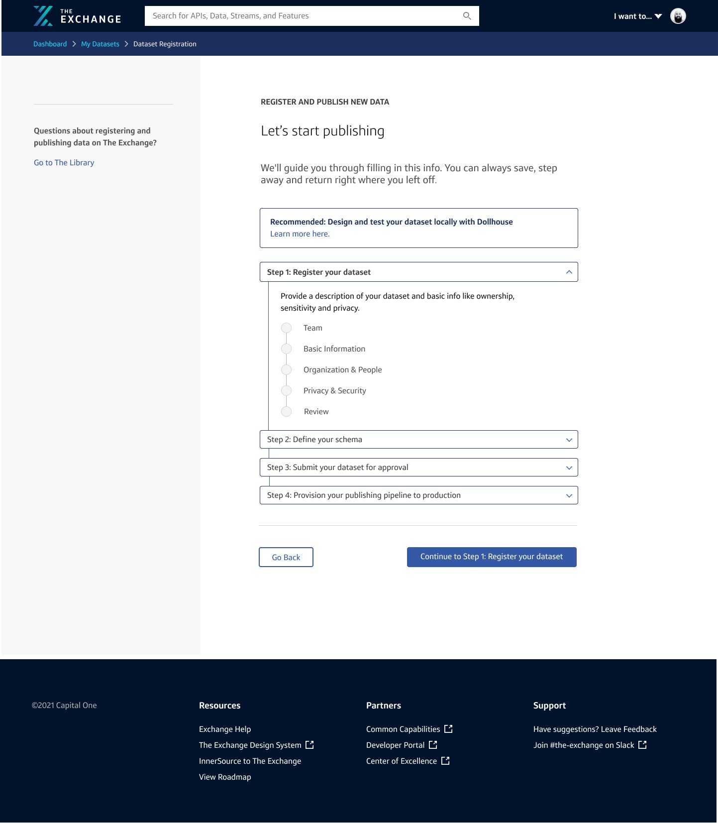
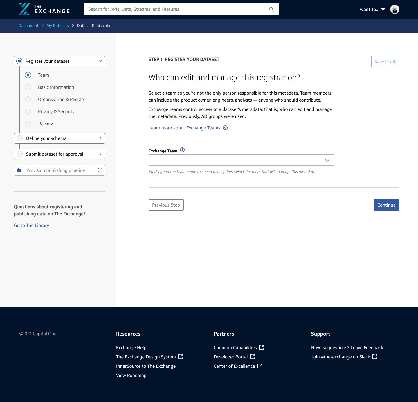
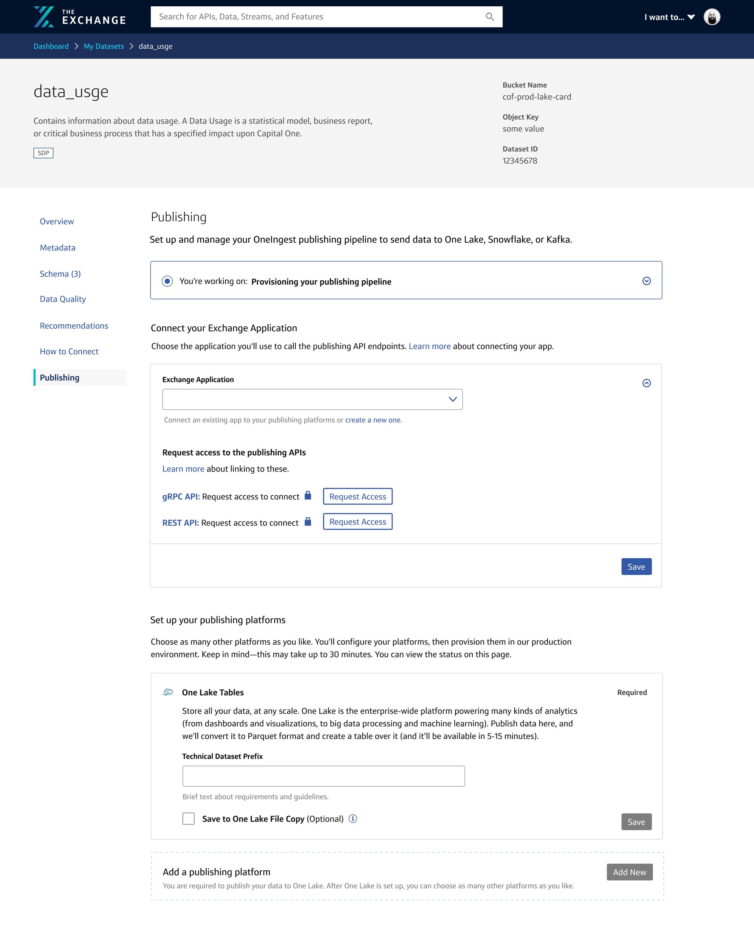
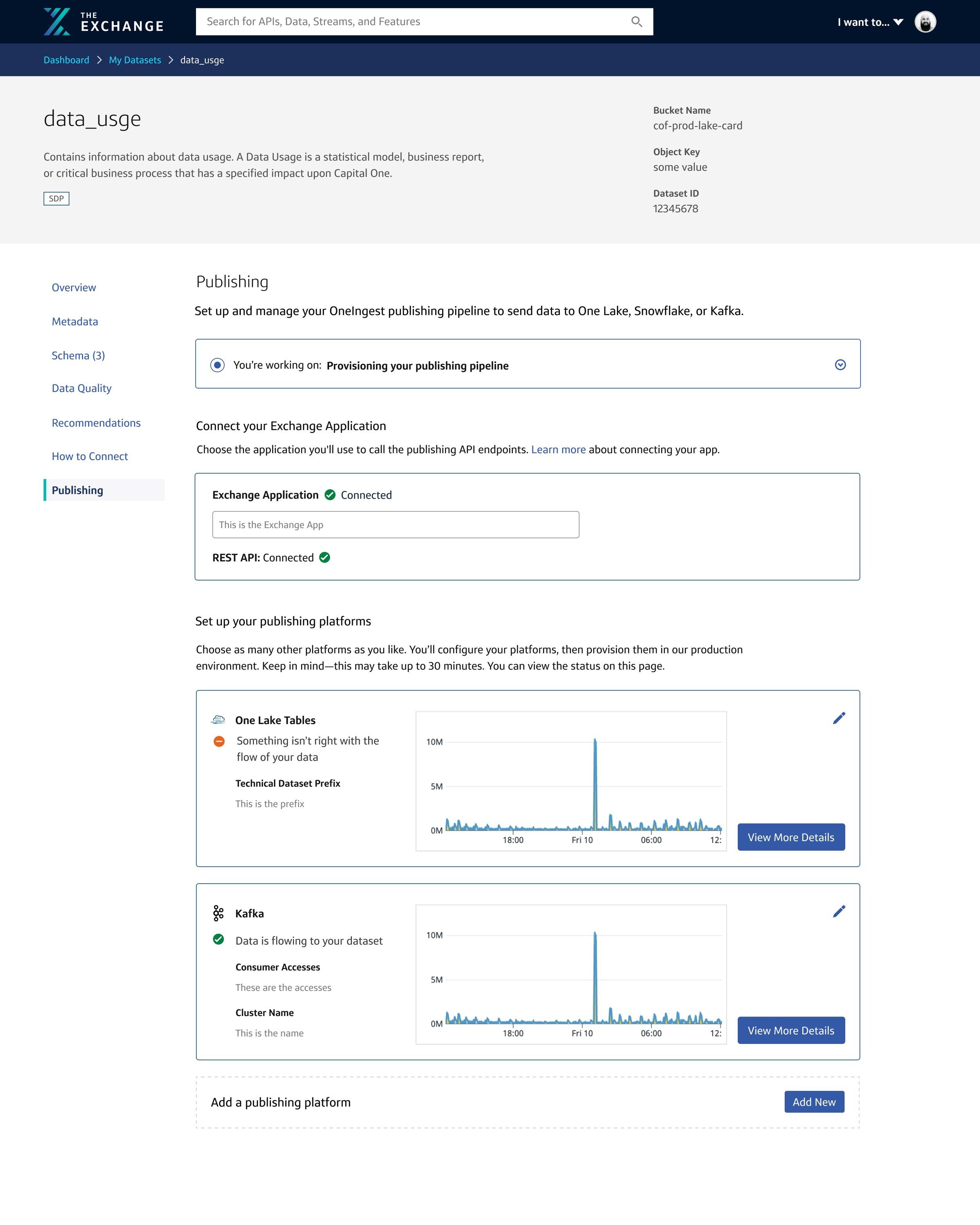
Publishing Workflow
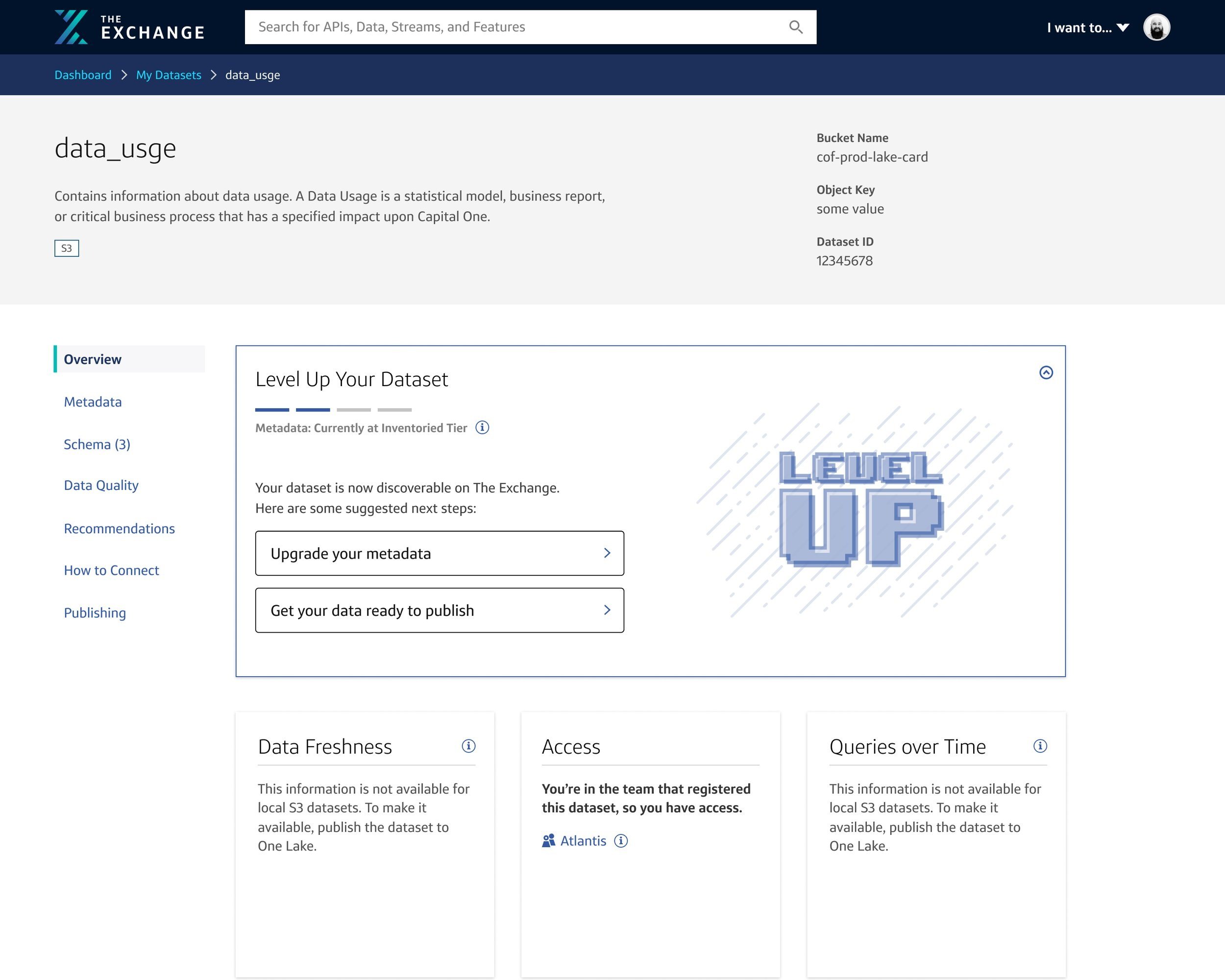
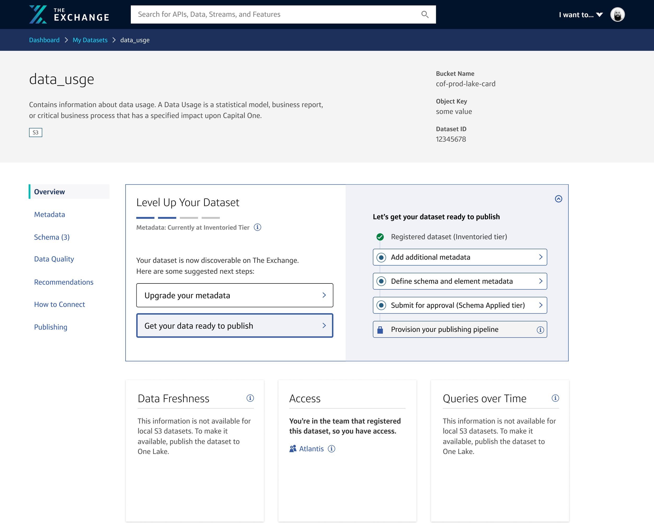
These are some examples of the screens that our associates would see as they complete the publish workflow. The goal of this flow was provide the user with enough guidance and understanding of each step while allowing them to “choose their own adventure” if they wanted to hop between steps. Publishing is a leveled up experience from our registration workflow. Registering data is a lot like completing an application for your data, requiring the user to provide information about the dataset they intend to make public. To make their data fully accessible to other associates, they have to publish the data and add additional metadata or information to meet data governance standards. Once this is done successfully, the data owner can monitor their data and make revisions as they need.


PUBLISHING COLLABORATION
This map explains how three different workflows would live together in our data ecosystem. Beyond publishing, the flow switches between data reviewers and consumers. The publishing workflow allowed for a unique opportunity to work with two designers owning the review process, two other designers working on collections of data and cross-functionally with designers creating the finance platform.

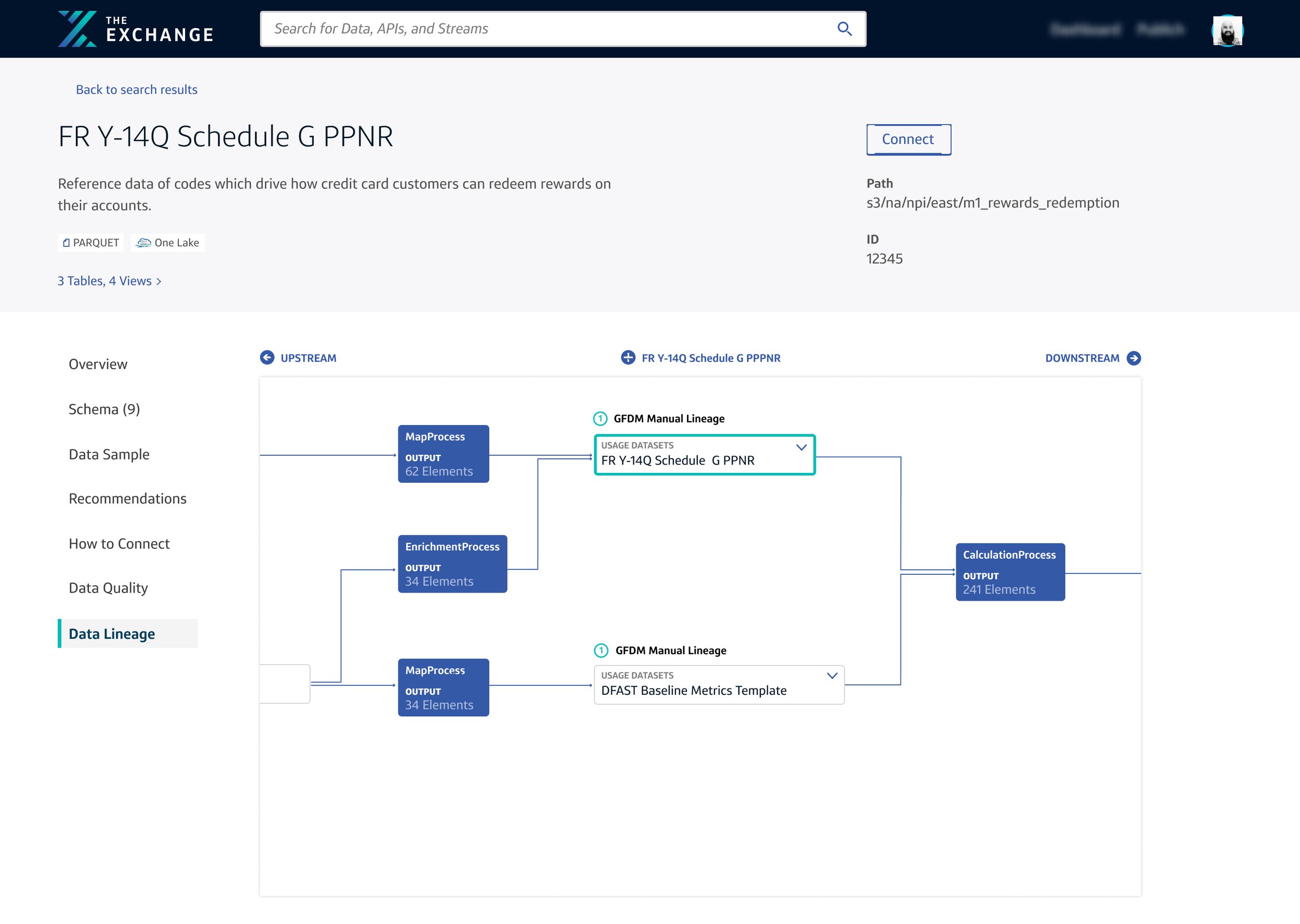
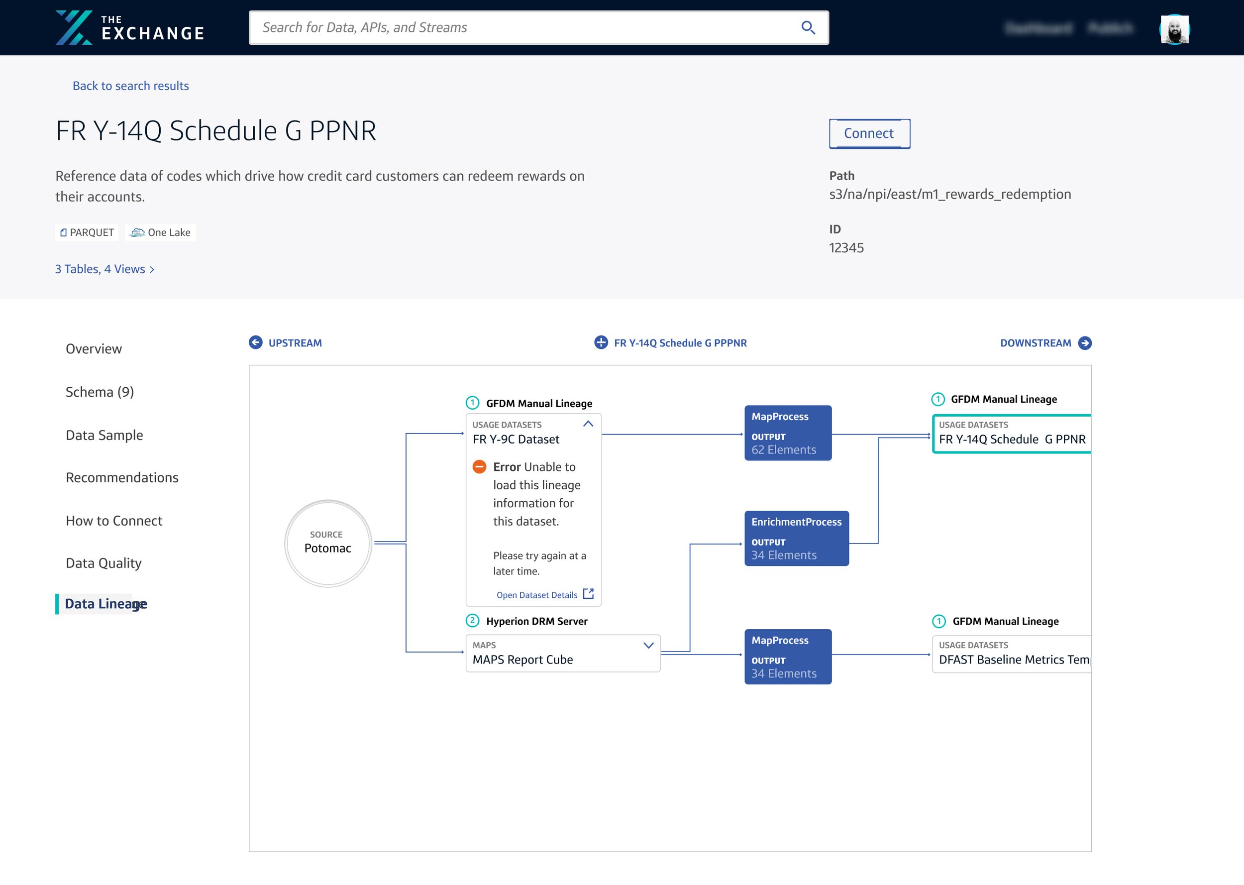
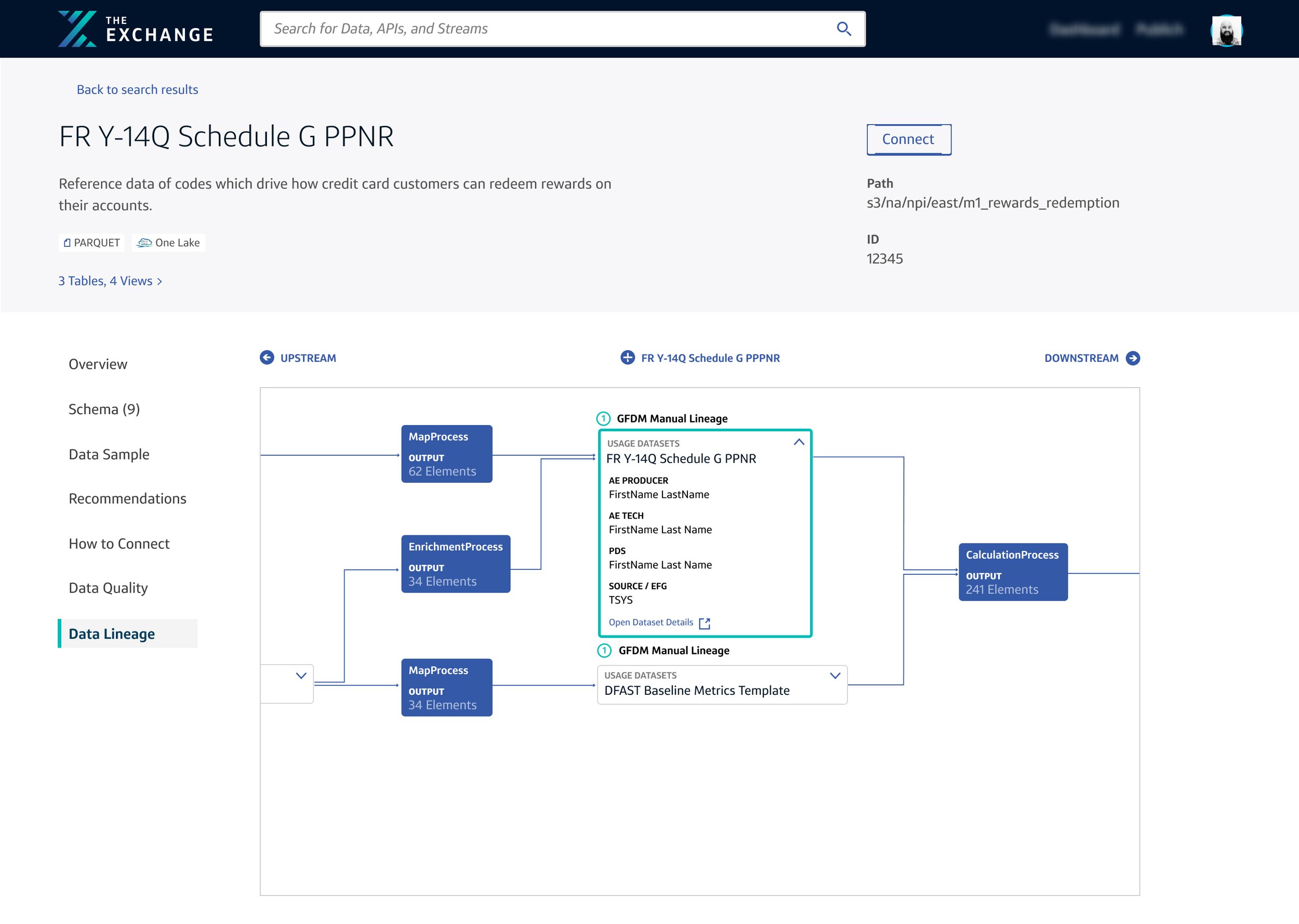
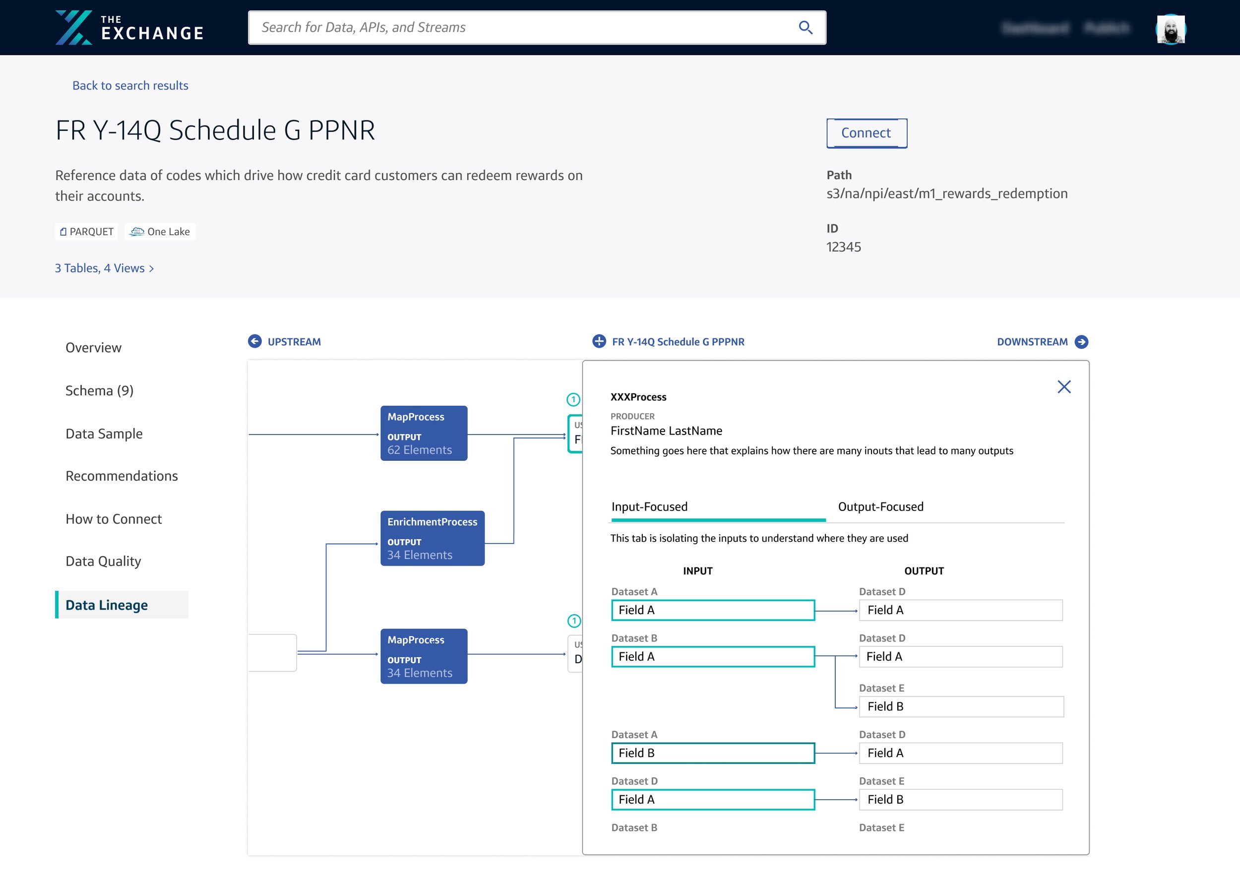
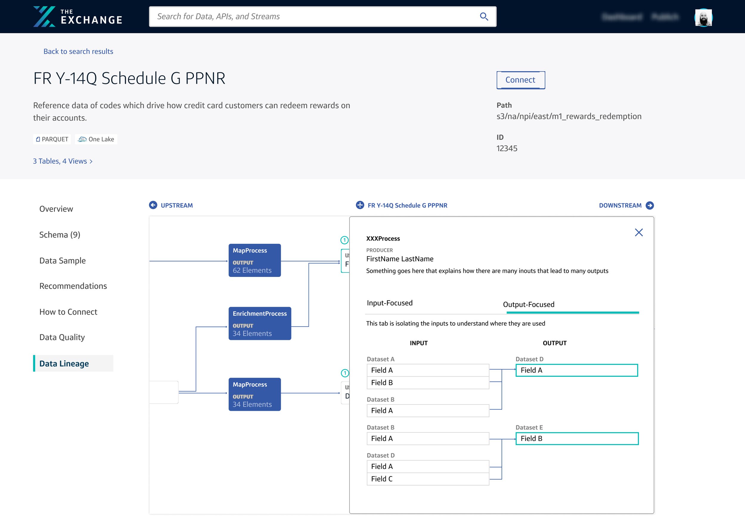
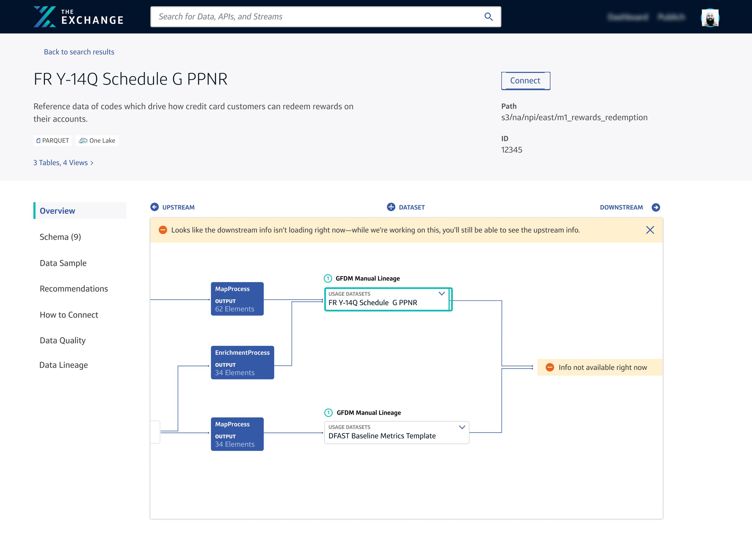
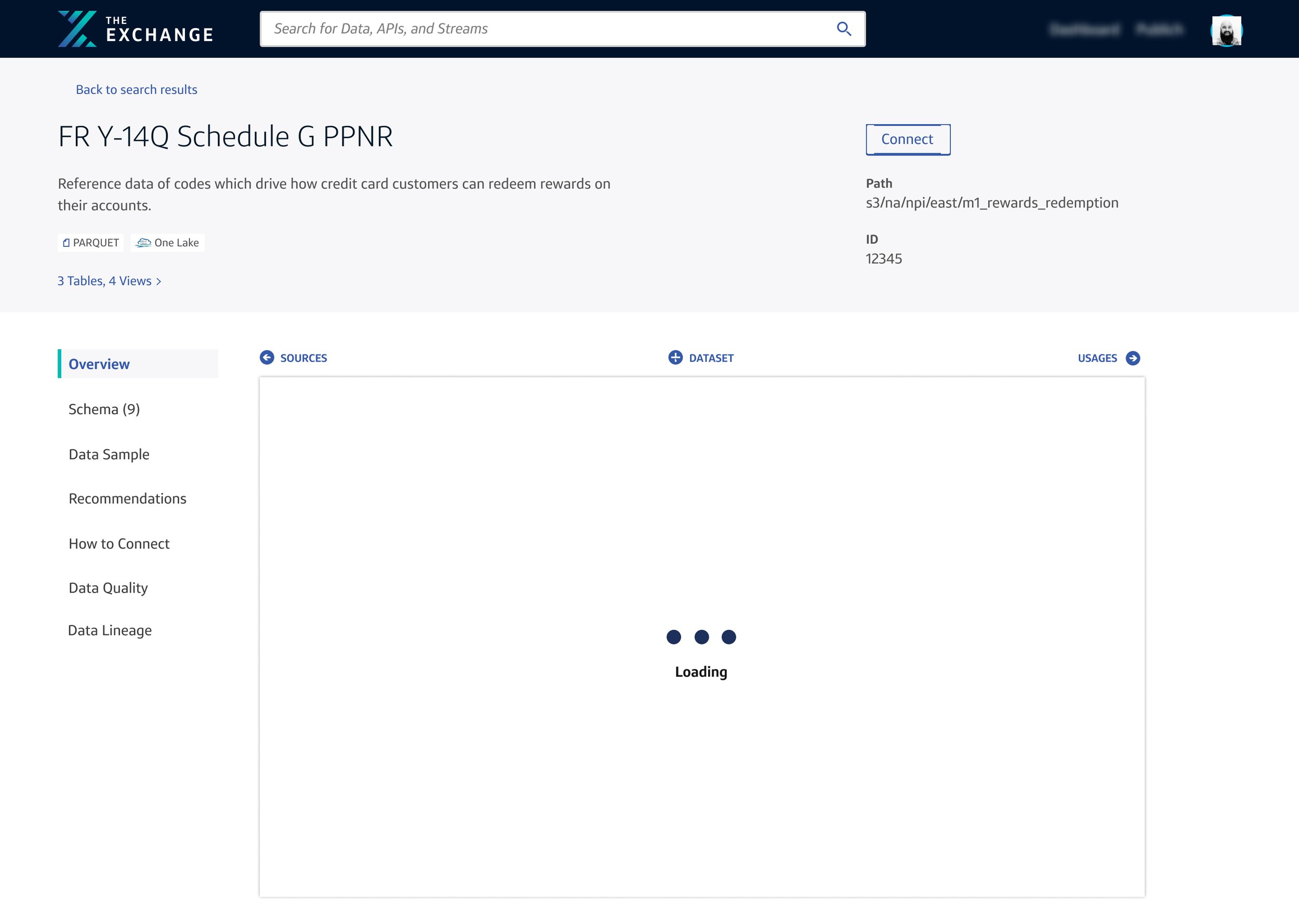
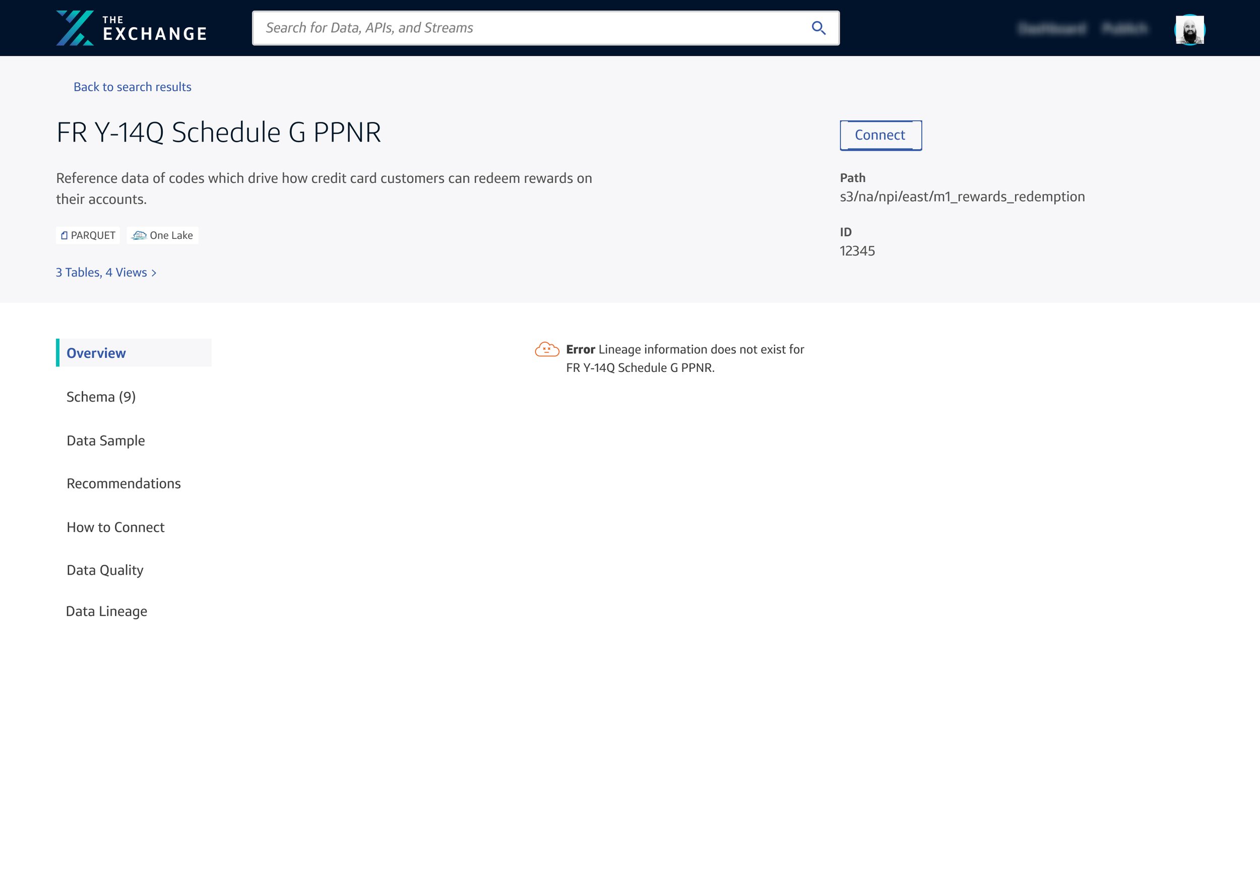
LINEAGE IN DATASET DETAILS
In addition to publishing, I designed a data visualization for the dataset details on The Exchange. The platform is broken up into different portfolios based on jobs-to-be-done by our users, our internal Capital One associates. This project lived in the consume side of the data ecosystem. This means that our users would use this information to better understand where their data was coming from, how it had been processed and how it could be used.
Essentially, this visualizes the family tree of a piece of data at Capital One.


Additional Work at Capital One
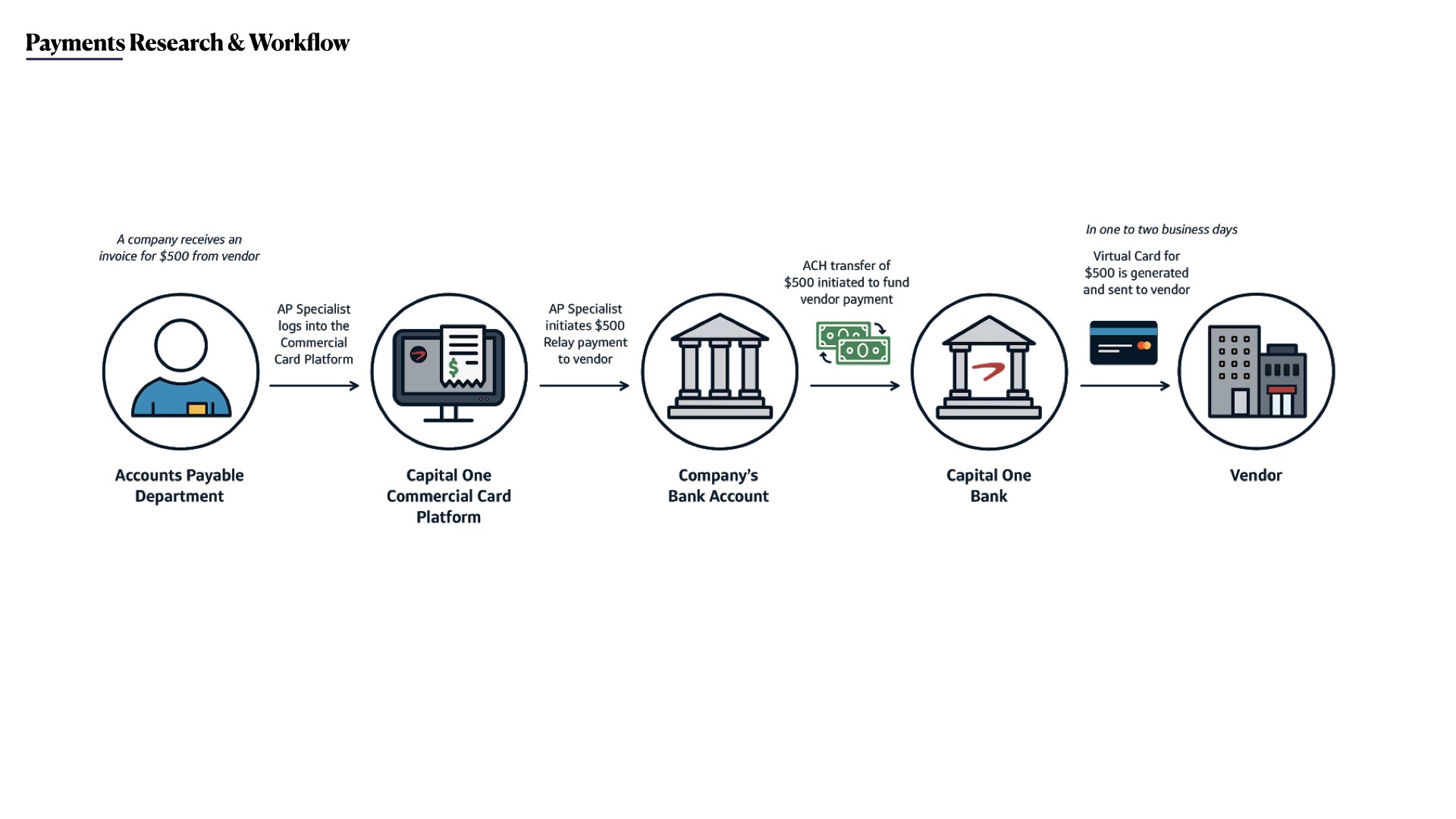
COMmERCIAL CARD PAYMENTS PLATFORM (B2B Payments)
During my first year at Capital One, I worked on an Electronic Accounts Payable platform that enabled B2B clients to manage their money and process payments.
Our design was integrated with our developers. Alongside my design manager, we partnered with four different engineering teams and 4 product managers to drive business initiatives to bring this platform into the 21st century. Throughout my year there, we added two additional designers to our team.
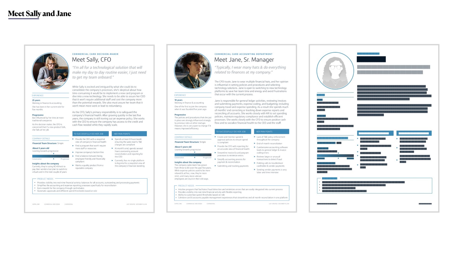
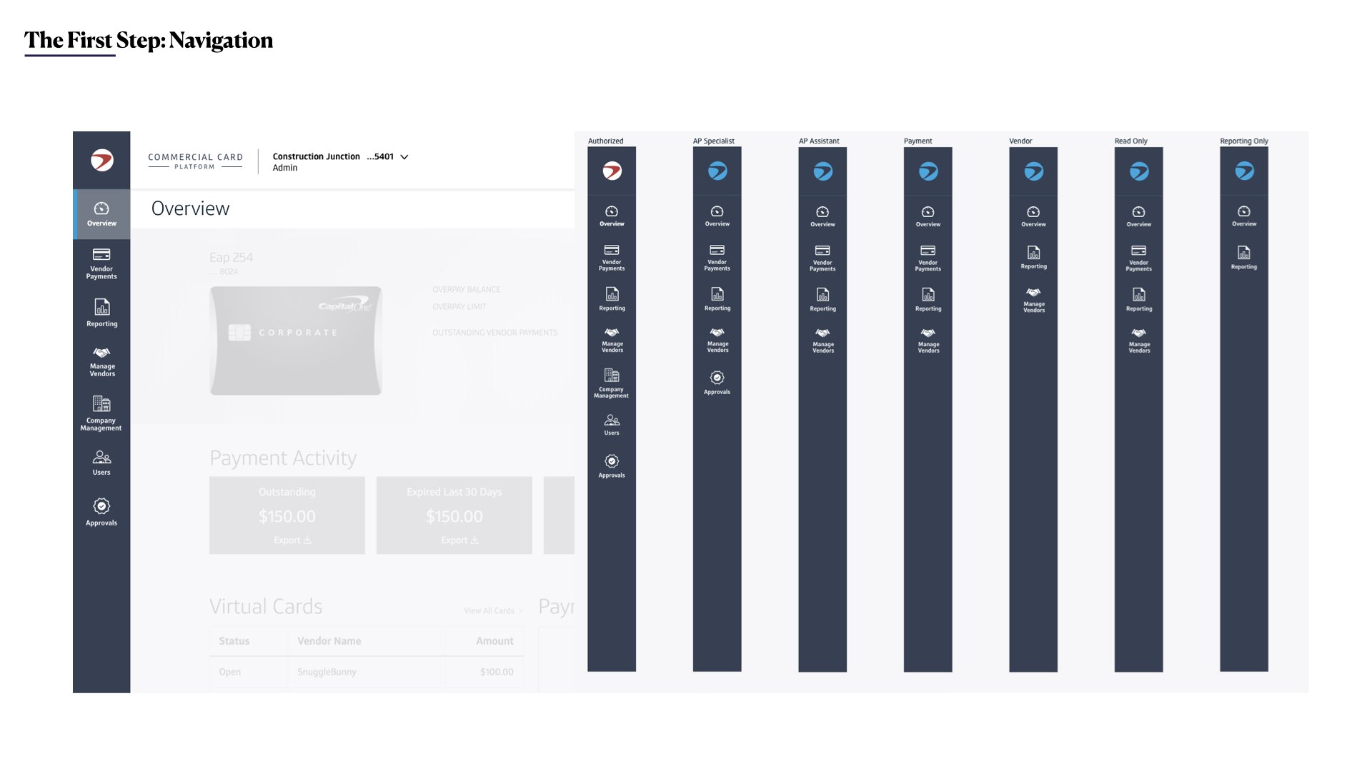
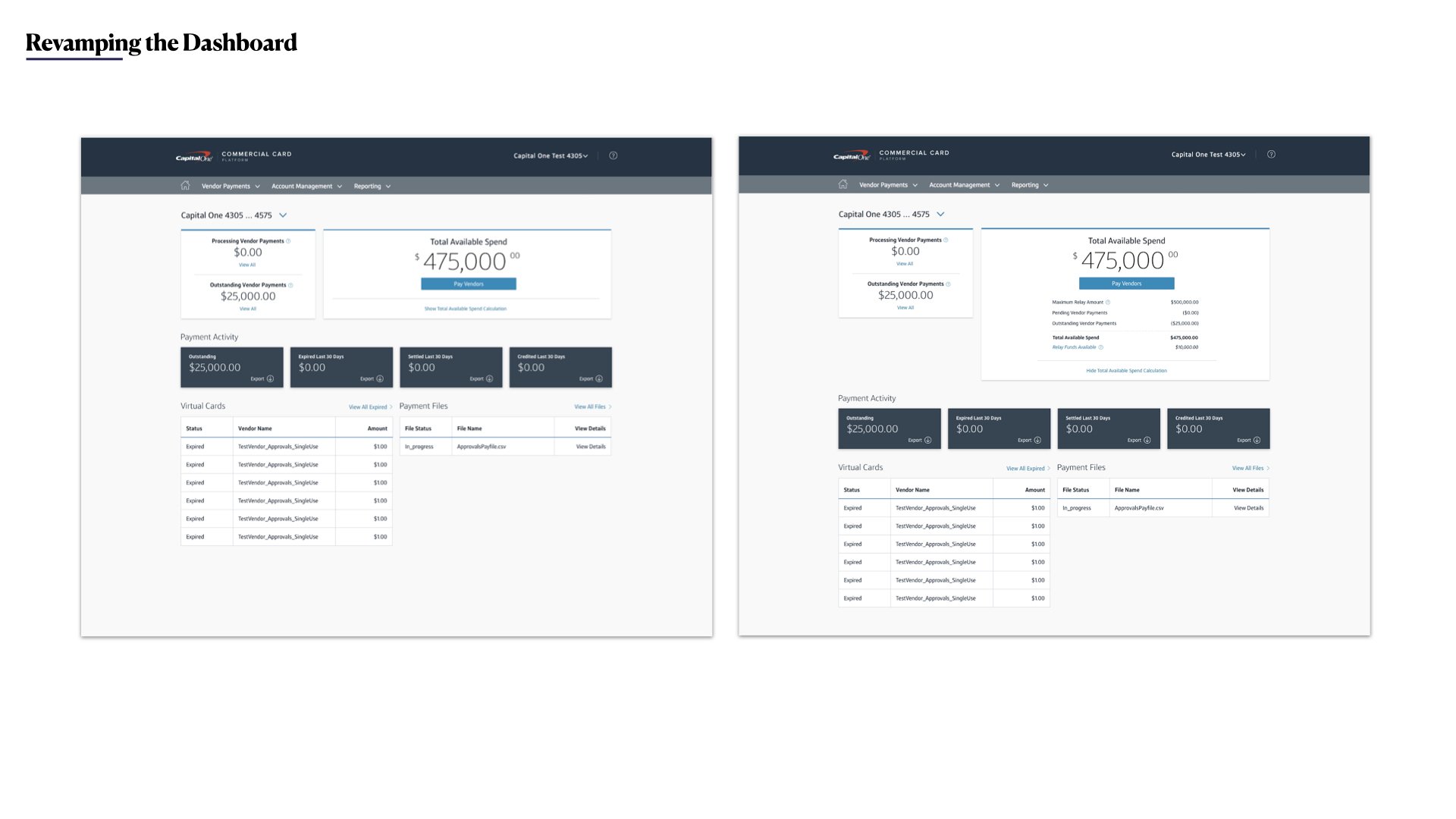
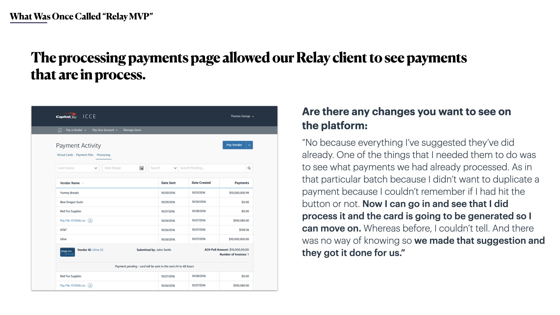
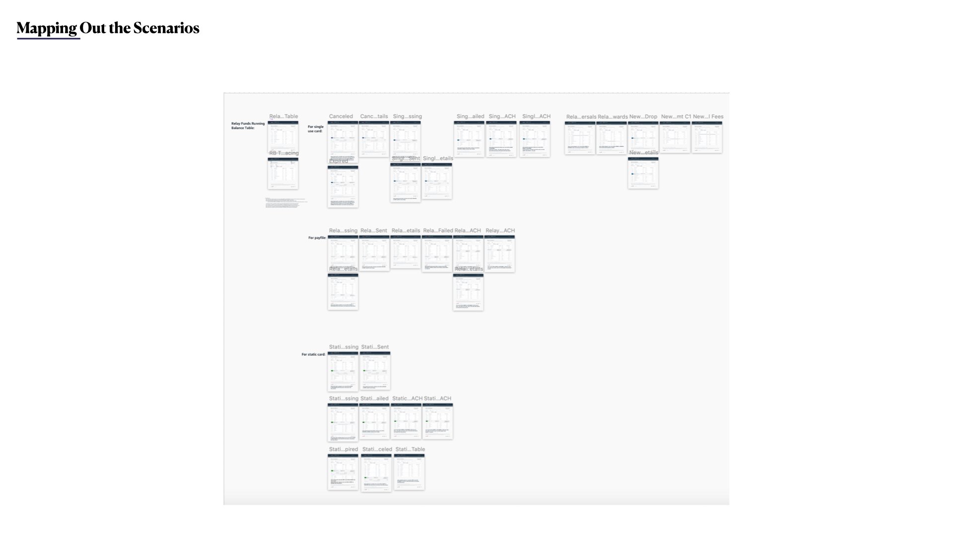
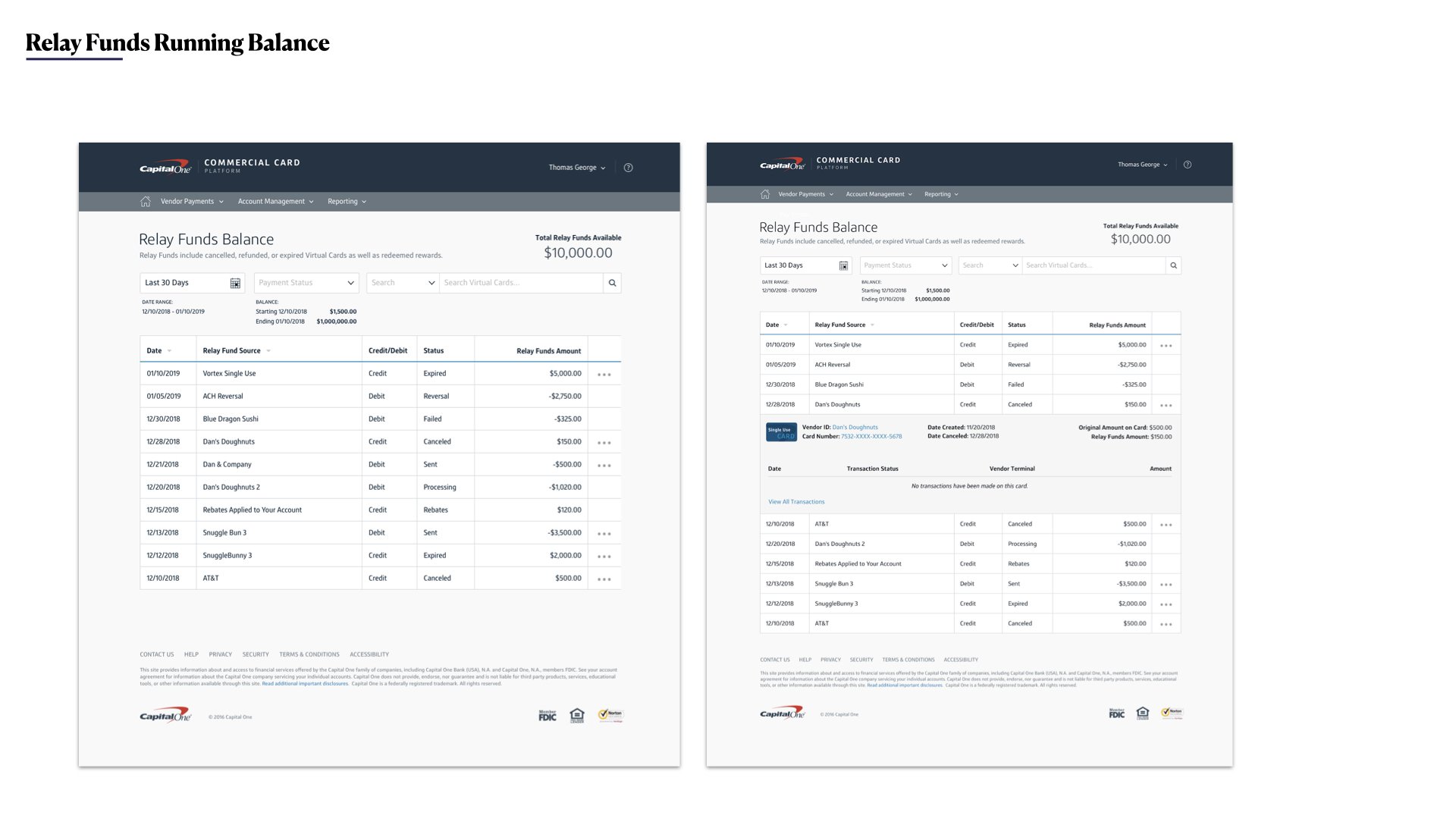
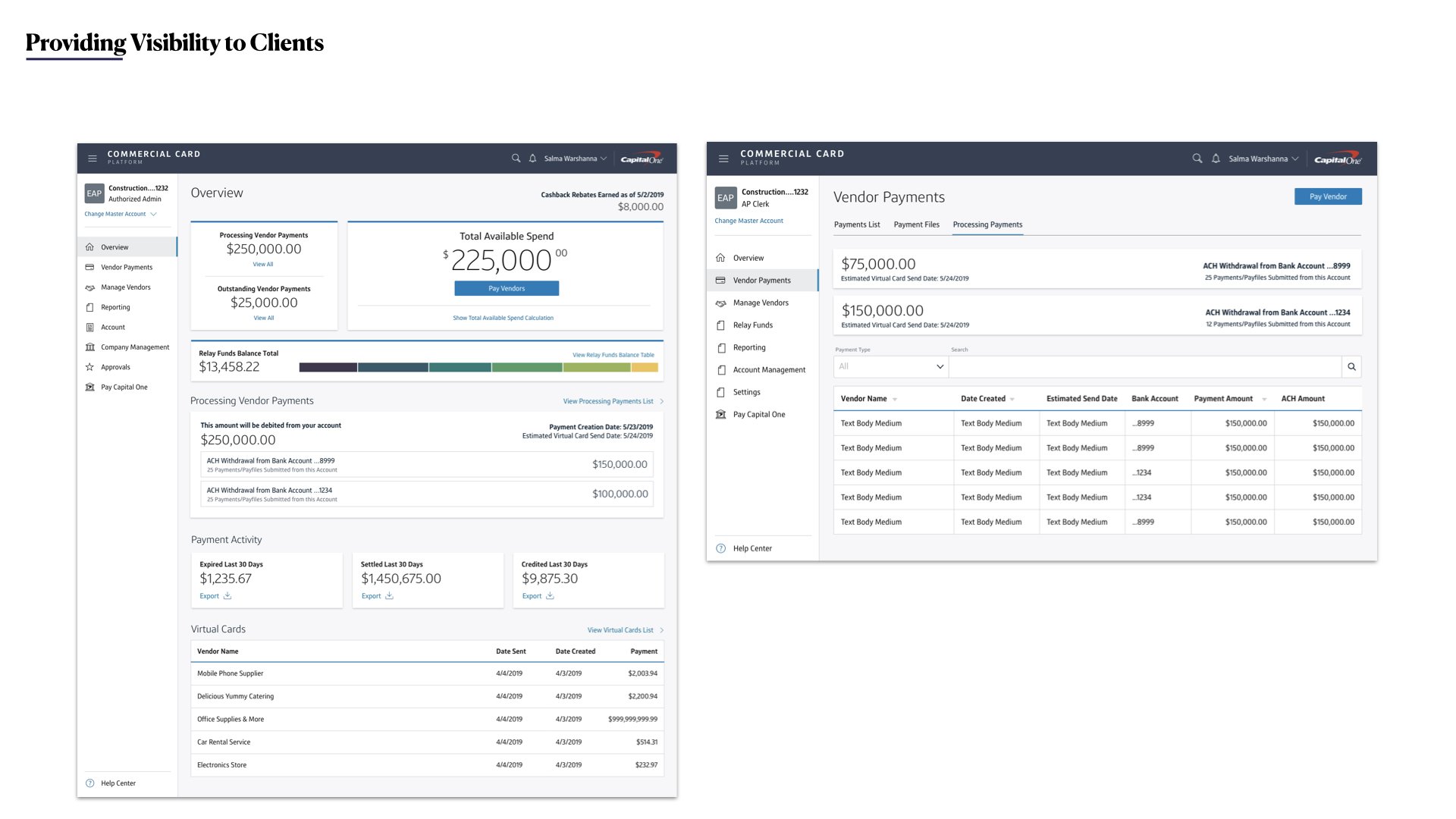
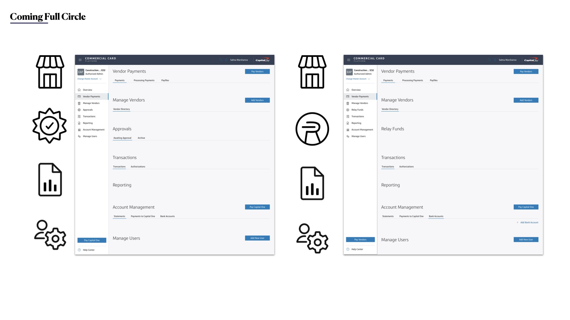
I worked on visual design refreshes and redesigned for our processing payments pages. I created visualizations to represent the workflow for our users. I worked collaboratively with our UX research team to lead in-person empathy interview sessions and usability testing as well developed personas for our larger team.
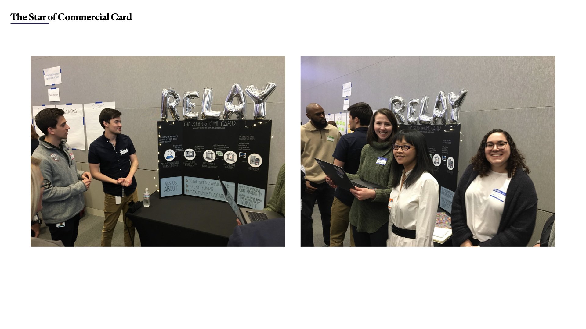
Below are some examples of the work from my year with Commercial Card —